eSimCard

Selling an invisible digital product like an eSIM requires an interface that feels instantly reliable, modern, and effortlessly fast. For Alpha eSIM Card, we designed a high-contrast, RTL-optimized platform that eliminates the anxiety of international roaming. By anchoring the hero section with a glowing digital network graphic and immediately presenting a prominent destination search bar alongside popular country flags, we bypass marketing fluff and connect the user directly to the solution they need in a single click.
Hero Experience: Frictionless Global Connectivity
We engineered the hero section to bypass marketing fluff and get the user straight to the solution. By anchoring the top fold with a glowing digital network graphic and immediately presenting a prominent destination search bar alongside popular, recognizable country flags, we created a highly functional interface that drives immediate user action.
esimcard-section1

Overcoming Knowledge Barriers: The Education Hub

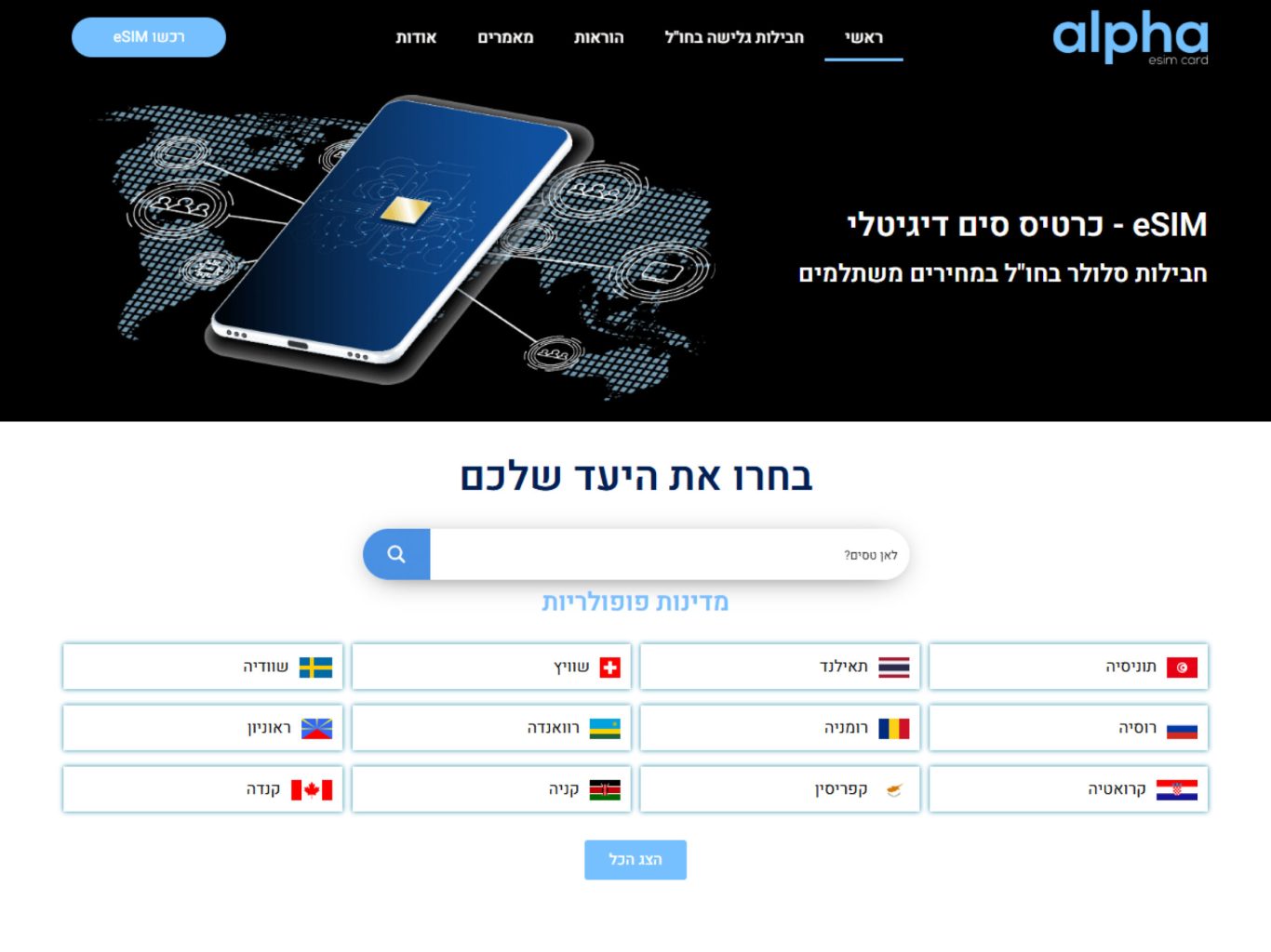
While eSIM technology is revolutionary, it still requires user education to drive mass adoption. We designed the "What is eSIM?" section to feel like a premium tech showcase rather than a dense instruction manual. Using a cinematic, glowing microchip visual alongside digestible, authoritative copy, we visually demystify the technology. This strategic choice builds immediate trust, positioning the brand not just as a vendor, but as an expert guide in digital connectivity.

Visualizing Benefits: The Trust Grid

Online shoppers scan for value before they commit to reading details. We engineered the "Advantages" section as a highly scannable, icon-driven grid over a clean, light background to provide a visual breathing space. By cleanly highlighting key selling points—such as instant activation, zero physical hassle, and significant cost savings—we logically validate the user's desire for an easy travel experience. This layout significantly reduces cognitive load and accelerates the path to checkout.

The Safety Net: Accessible Support

Purchasing digital communication services for international travel inherently carries a level of buyer anxiety. To neutralize the "What if it doesn't work when I land?" hesitation, we designed the pre-footer contact section to be highly visible and reassuring. By pairing a sleek device mockup with clear, direct contact information over a deep, professional blue, we signal that real, reliable support is readily available, ensuring the user feels safe completing their transaction.

More of our projects

Web Applications / SaaS

Get in Touch