visuwrite

For the visuwrite project, we created a full brand identity designed to look great on physical items and digital screens. The design features an easy-to-read wordmark paired with an icon that combines a photo frame, text lines, and a star. To show how the brand works in real life, we built a preview grid displaying the logo on employee badges, tablet screens, phone interfaces, metallic signs, fabric textures, smartwatches, and apparel.
Project Overview: A Complete Look at the Identity
A great brand needs to look good wherever it is placed. We tested the visuwrite assets across multiple formats to ensure high quality. This includes placing a vertical layout on office ID tags, setting up square app icons for tablet interfaces, and checking the icon's look inside a mobile phone home screen. We also paired the main logo with custom metallic textures and fabric stamps to prove it works perfectly for office styling and merch.
visuwrite-sec1

Screen Presentation: Perspective Grid

To present the brand to stakeholders in a realistic digital context, we placed the logo assets on an angled tablet mockup. This view shows how the white, gradient, and dark versions of the logo look on a smooth glass screen. It helps prove that the brand values stay consistent when moving through light and dark user interface themes.

Brand Guidelines

The design system relies on a very simple color and font rulebook to keep the brand looking consistent. We picked a deep purple accent color (#612569) to pair with a solid black neutral tone (#000000), alongside a smooth gradient style for backgrounds. For the typography, we chose Berlin Sans FB as the primary font, giving the name a friendly, rounded shape that is highly readable on user dashboards.

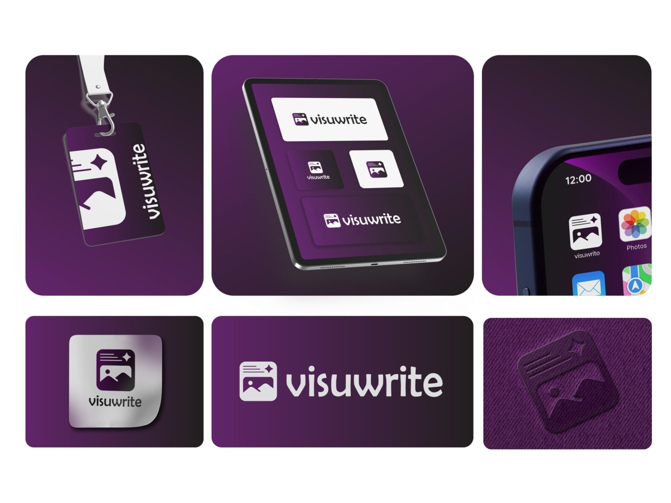
Technical Layout: Safe Space Guide

To make sure the logo always stands out, we created a strict safe space guide. The lines show the mandatory clear space that must be left empty all around the logo. By using the size of the icon itself to measure this border, we guarantee that other page elements, text blocks, or screen edges never crowd the logo, keeping it clean and easy to see.

Digital Presentation: Tablet Standalone View

To complement the perspective layout, we designed a front-facing digital screen mockup to emphasize pure scale and alignment. This presentation showcases the layout of the primary logo against three different backgrounds. By choosing a clean white backdrop for the core logo block, we show how the purple tone creates contrast and holds user attention in any app setup.

Logo Options: Built for Versatility

To give the client full flexibility, we designed the logo to adapt to different layouts. The main layout places the icon directly to the left of the clean wordmark on a bright background. For smaller spaces, we created an isolated square icon version, a dark background option, and a stylized corporate card layout that crops the icon along the bottom edge for a modern look.

More of our projects

Web Applications / SaaS