Web Development

Marketing

Design

SEO

Web Development

Flexible websites built on WordPress.

Online stores built around your products.

E-commerce within your WordPress website.

From product discovery to checkout.

A focused page for your next campaign.

Your business details in one digital place.

The infrastructure behind your website.

Ongoing care for your website.

A more accessible web experience.

Marketing

A clear direction for your marketing.

Connect your brand with its audience.

Bring your next campaign together.

Reach audiences through paid media.

Improve the path from visit to action.

A consistent presence across your channels.

Content built around your brand.

Stay connected through relevant email.

Connect through creators and communities.

Tell your brand story through video.

Bring your music to digital platforms.

Design

A distinct visual language for your brand.

Clear journeys. Thoughtful interfaces.

A website shaped around your business.

A fresh direction for your existing site.

Visual content for your social channels.

Turn your message into a clear story.

A considered first impression.

Visuals for your digital campaigns.

Your message, ready to share.

SEO

Expert direction for organic search.

Understand what needs attention.

Strengthen your website’s search foundations.

Focus on the searches that matter.

Useful content with search in mind.

Develop your website’s authority.

Be found where your customers are.

Build visibility across your market.

Help shoppers discover your products.

Support your brand’s online presence.

3D Click

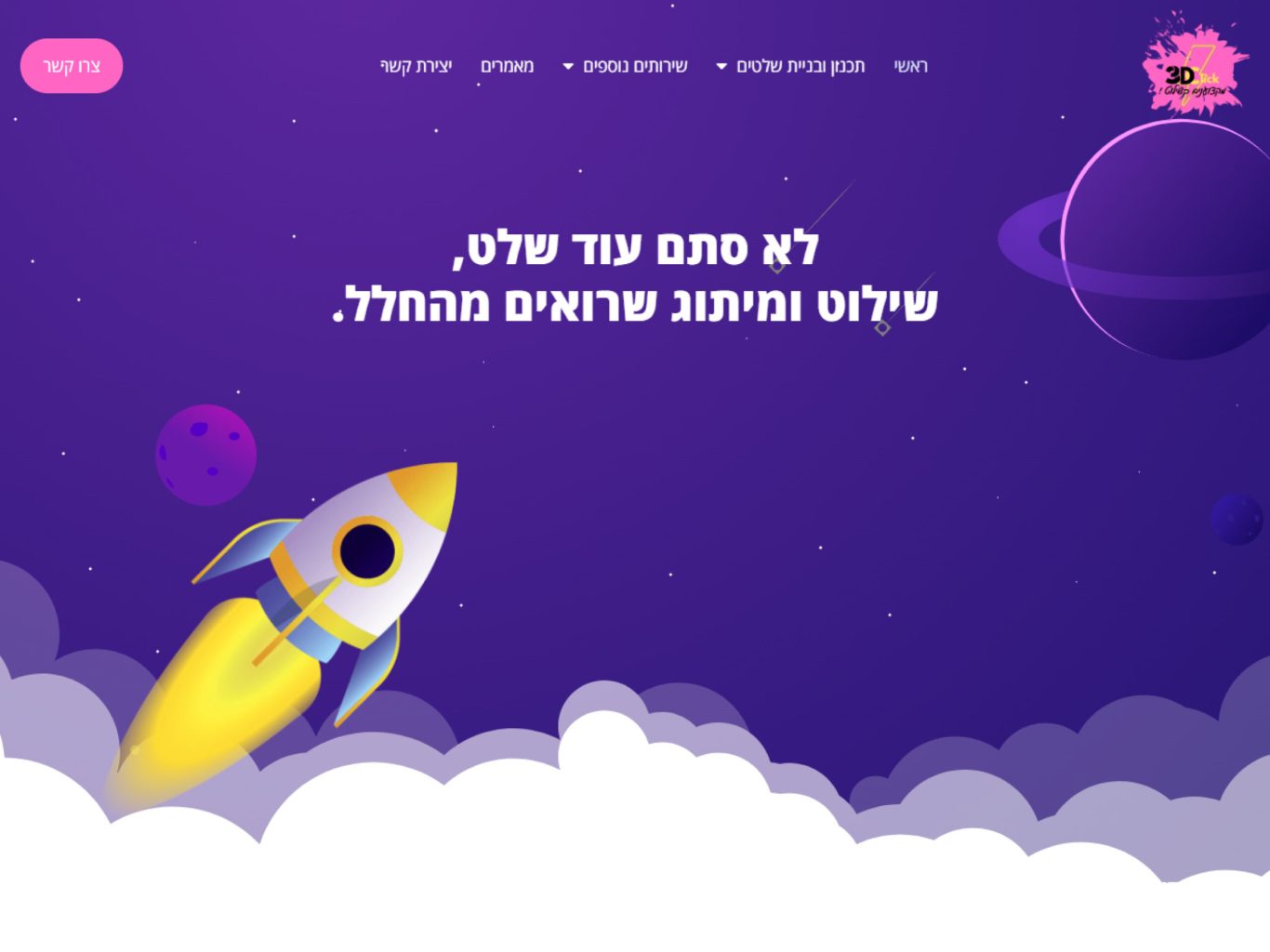
Designing a digital platform for a 3D signage and branding company requires an identity as bold and creative as the physical products they produce. For 3D Click, we completely bypassed the standard, dry industrial B2B aesthetic and engineered a vibrant, space-themed digital experience. Utilizing a striking purple and pink color palette with dynamic rocket illustrations, we positioned the company as an innovative, boundary-pushing partner for brands that demand to be noticed.
The Hero Section: High-Impact Messaging
The hero section serves as an immediate visual hook. We paired a sleek, rising rocket illustration with an assertive, RTL-optimized headline that translates to "Not just another sign, signage and branding seen from space." This high-energy visual metaphor instantly communicates the brand's promise of ultimate visibility and scale, capturing the user's imagination before they even begin to scroll.
3dclick-section1

Service Architecture: SaaS-Level Clarity

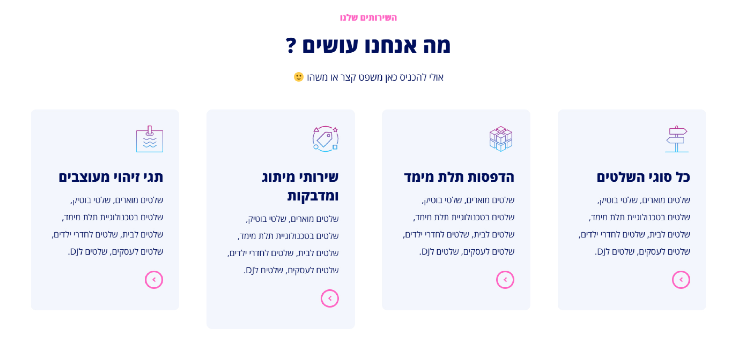
Manufacturing and custom physical branding services can often seem complex to potential buyers. We solved this by structuring the "What We Do" section into a clean, modern, four-column grid that mirrors the intuitive UX of a tech or SaaS platform. By incorporating custom, gradient-line iconography, we made distinct physical offerings—like 3D printing, laser cutting, and custom signage—highly scannable and easy to digest.

Social Proof: Dynamic Trust Building

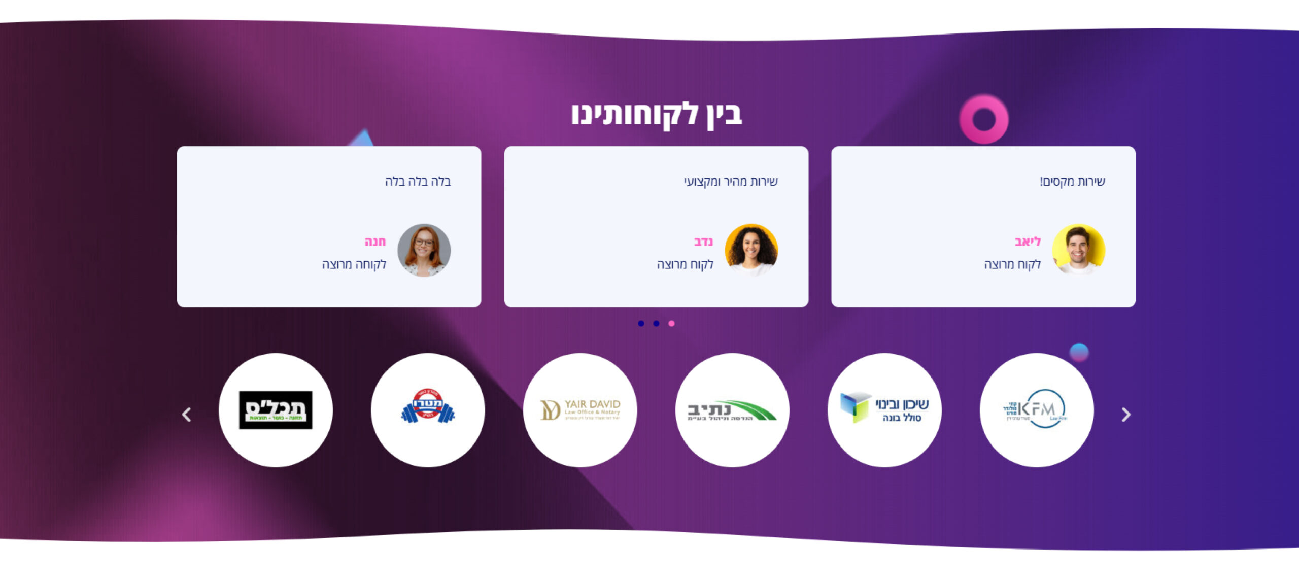
To convert high-ticket B2B clients, trust is paramount. We engineered a robust social proof section that operates on two distinct levels. First, relatable client testimonials presented in clean, floating cards provide immediate human validation. Second, a dynamic, scrolling carousel of corporate partner logos establishes deep industry authority. Setting this against the immersive brand gradient keeps the energy high while cementing credibility.

The Mid-Funnel Hook: Playful Engagement

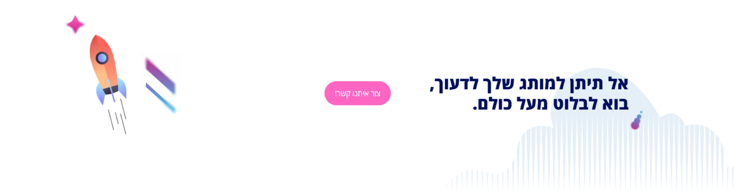
To prevent user drop-off during the scroll, we integrated a dedicated, mid-page Call to Action (CTA) block. Using ample white space to provide visual relief from the heavy, dark gradients, we reintroduced the playful rocket motif alongside compelling micro-copy. The vibrant pink CTA button acts as a high-contrast trigger, creating a frictionless pathway for users who are ready to engage before reaching the bottom of the funnel.

The Conversion Engine: High-Contrast Lead Capture

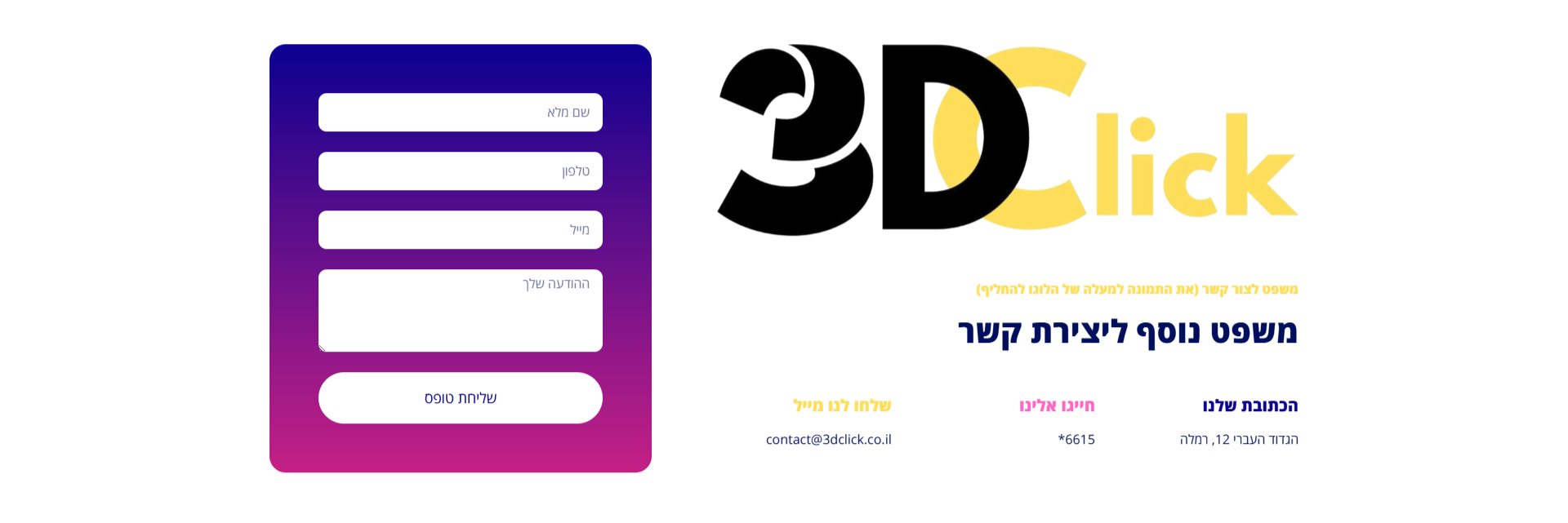
The primary goal of a service website is lead generation. We designed the contact block to be visually striking and impossible to ignore. By housing the clean, white form fields within a vibrant purple-to-pink gradient card, we aggressively directed the user's focus to the conversion point. Placing the massive, 3D-styled company logo right next to the form reinforces the brand's identity at the exact moment of commitment.

The Footer: Organized Navigation

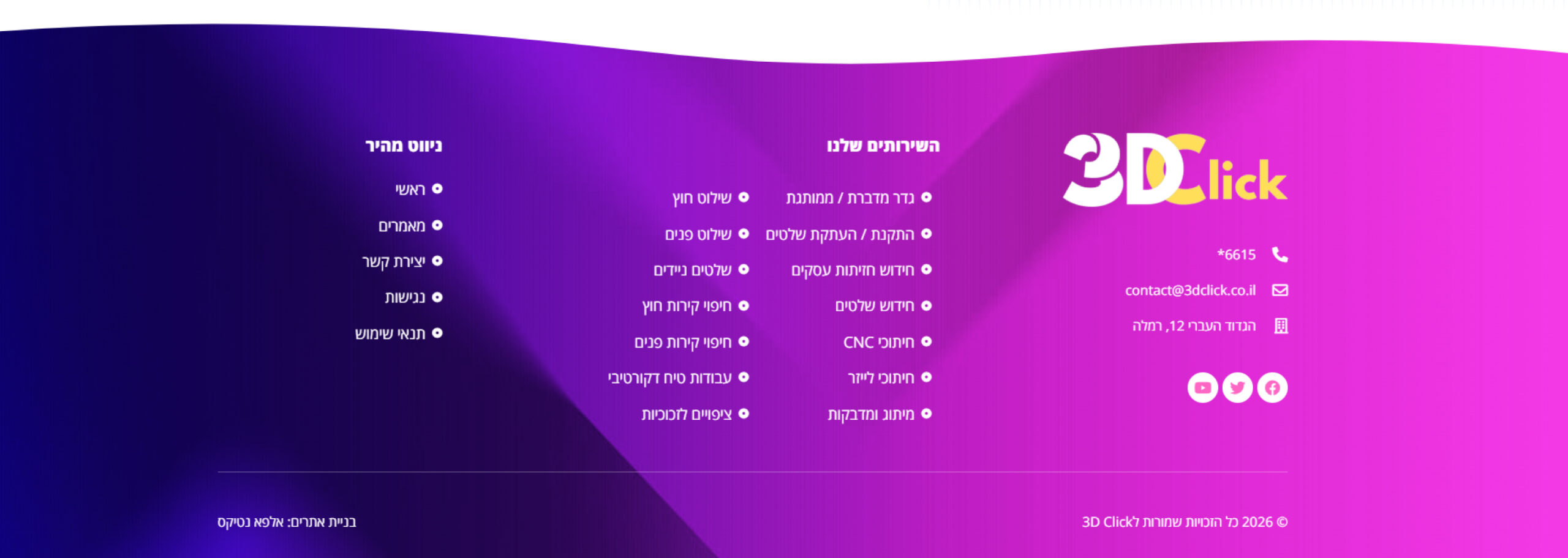
A well-structured footer is an essential tool for SEO and user retention. We utilized a rich, sweeping gradient background to maintain the brand's energetic aesthetic all the way to the bottom edge. By categorizing the links into distinct, RTL-aligned pillars (Quick Links, Services, Contact Info) alongside clear social media icons, we created a highly functional directory that smoothly concludes the digital user journey.

More of our projects

Web Applications / SaaS

Get in Touch