Web Development

Marketing

Design

SEO

Web Development

Flexible websites built on WordPress.

Online stores built around your products.

E-commerce within your WordPress website.

From product discovery to checkout.

A focused page for your next campaign.

Your business details in one digital place.

The infrastructure behind your website.

Ongoing care for your website.

A more accessible web experience.

Marketing

A clear direction for your marketing.

Connect your brand with its audience.

Bring your next campaign together.

Reach audiences through paid media.

Improve the path from visit to action.

A consistent presence across your channels.

Content built around your brand.

Stay connected through relevant email.

Connect through creators and communities.

Tell your brand story through video.

Bring your music to digital platforms.

Design

A distinct visual language for your brand.

Clear journeys. Thoughtful interfaces.

A website shaped around your business.

A fresh direction for your existing site.

Visual content for your social channels.

Turn your message into a clear story.

A considered first impression.

Visuals for your digital campaigns.

Your message, ready to share.

SEO

Expert direction for organic search.

Understand what needs attention.

Strengthen your website’s search foundations.

Focus on the searches that matter.

Useful content with search in mind.

Develop your website’s authority.

Be found where your customers are.

Build visibility across your market.

Help shoppers discover your products.

Support your brand’s online presence.

Grillstone

Designing for the culinary market requires triggering the senses. For Grill Stone, we bypassed the typical “kitchen gadget” e-commerce look and built an immersive, dark-mode experience that feels like stepping into a luxury steakhouse. The RTL-optimized layout utilizes high-contrast racing reds and deep slate blacks to make the product photography pop, positioning the brand as a premium lifestyle choice for meat enthusiasts who want a restaurant experience at home.
The Hero Section: Motion & Appetite Appeal
The hero section doesn't just sell a stone; it sells an event. By placing a high-definition video player front and center against a textured, moody background, we instantly capture attention and demonstrate the product's value in action. The bold Hebrew typography—translating to "A restaurant experience in your home!"—paired with the vibrant red brand accent creates immediate emotional resonance and desire before the user even begins to scroll.
grillstobe-section-1

Visual Proof: The Recipe Grid

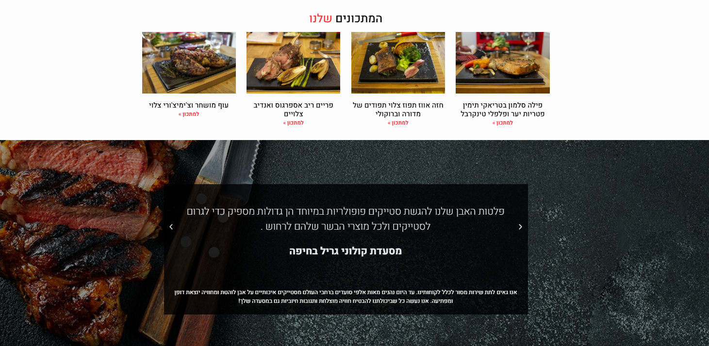
A common barrier to purchasing specialty cooking equipment is the user wondering, "Will I actually use this?" We countered this friction by designing a highly visual "Recipes" section. Instead of text-heavy instructions, we used a clean, card-based layout featuring rich, appetizing photography of various proteins—from steak to salmon. This strategic content not only educates the user but expands the product's perceived versatility.

Immersive Storytelling: The Dark Mode Gallery

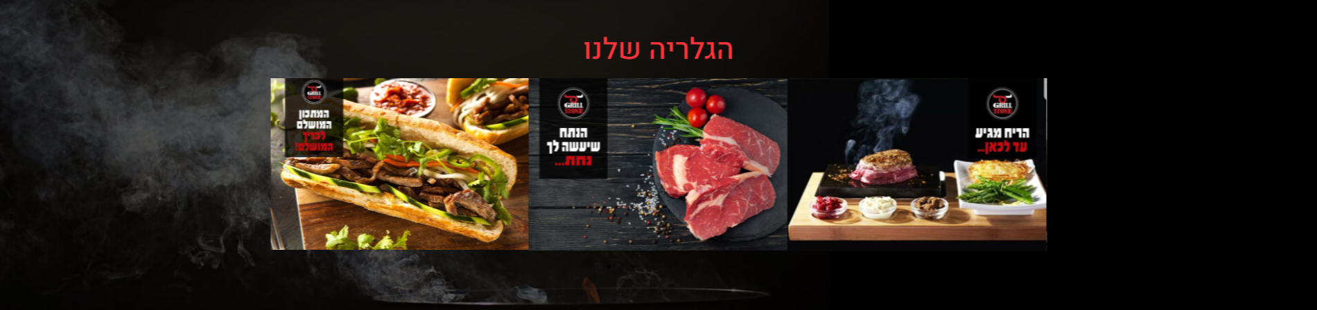
The middle funnel of the site is designed to build brand authority and trigger appetite. We utilized deep, cinematic black backgrounds overlayed with crisp typography for the brand's story, flowing seamlessly into an edge-to-edge visual gallery. By stripping away heavy UI containers and letting the high-contrast food photography speak for itself against the dark backdrop, we move the user from logical consideration into pure emotional desire.

Cross-Selling: The Bright Accessory Grid

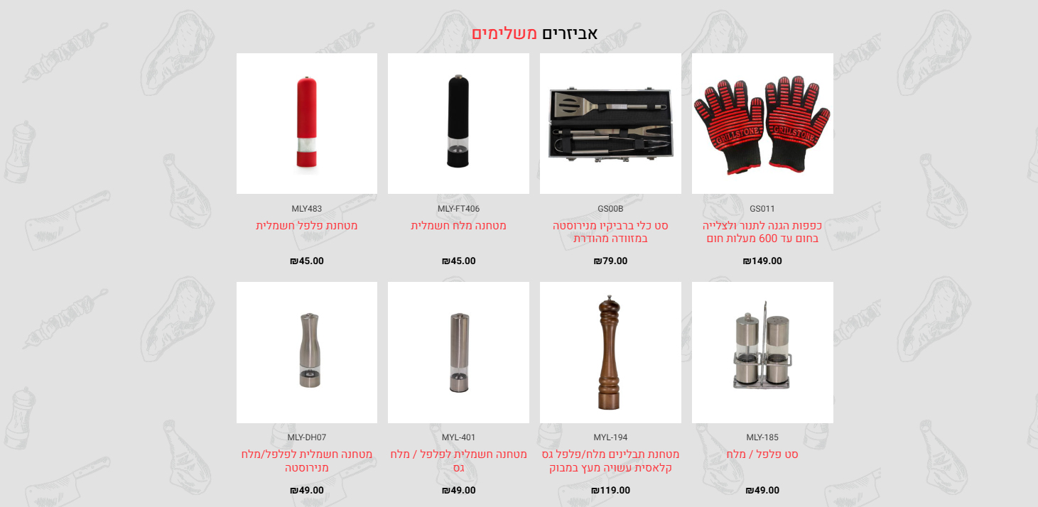
To maximize Average Order Value (AOV), we introduced an "Accessories" section. Strategically, we shifted the background from deep black to a clean, light grey with subtle, custom line-art textures. This visual break acts as a palate cleanser, organizing the secondary products (gloves, salt grinders, tools) into a highly scannable, frictionless e-commerce grid that encourages quick add-on purchases.

The Final Hook: High-Impact Conversion

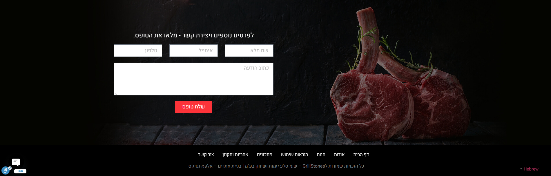
The footer and contact section must close the deal with authority. We anchored the lead generation form alongside a massive, ultra-premium image of raw Tomahawk steaks. The stark contrast of the white form fields and the high-visibility red "Submit" button against the dark, moody background ensures the user's eye is drawn directly to the conversion point, finishing the digital journey on a powerful, branded note.

More of our projects

Web Applications / SaaS

Get in Touch